
15 April 26
Beethoventown
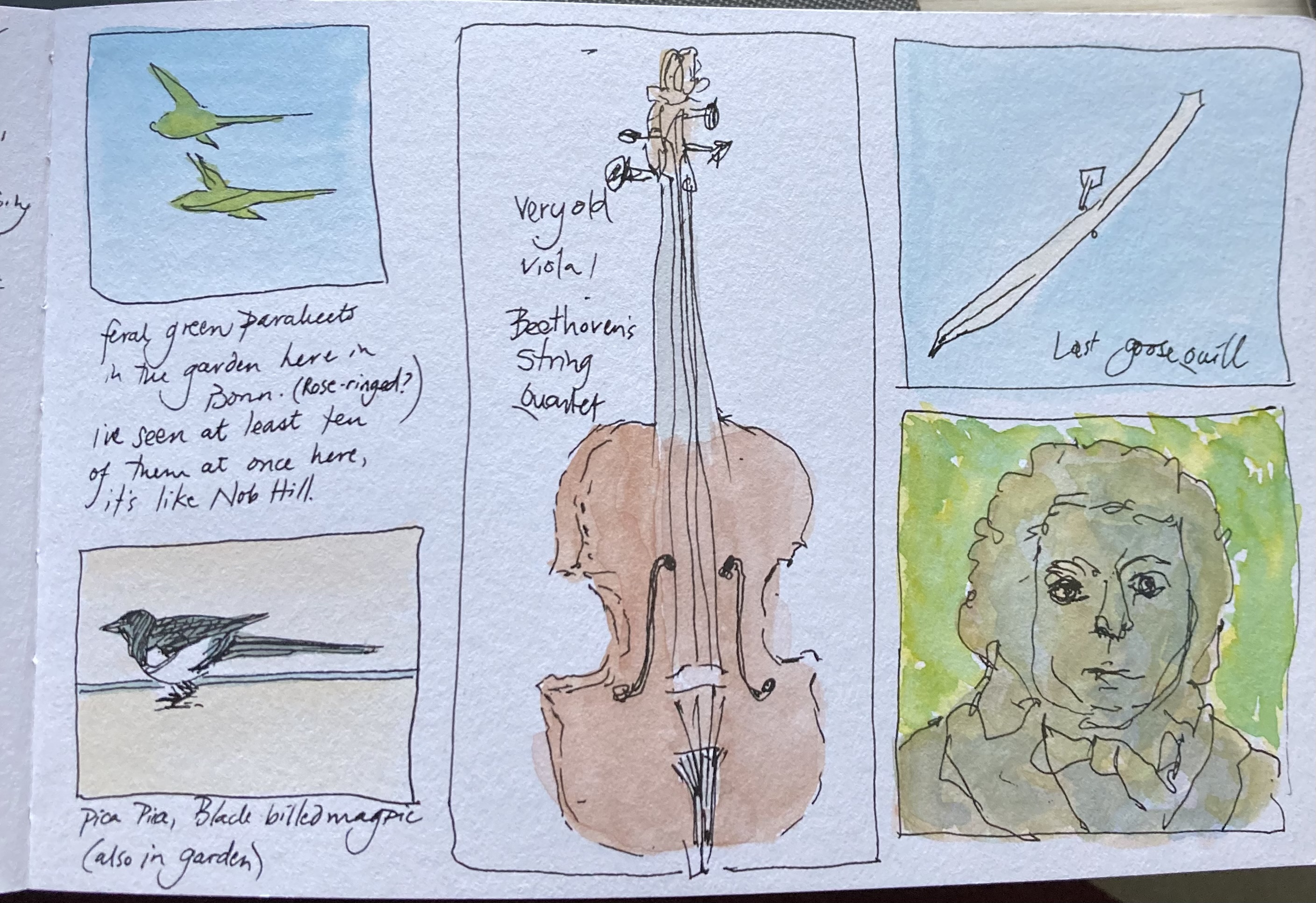
 Bonn isn’t about to let any visitor leave without knowing that its most famous son, the composer Ludwig von Beethoven, was born here. There is obviously the Beethovenhaus which I visited today. There is a Beethovenstrasse, a Beethovenhalle, a Beethoven Gymnasium, a Beethoven Park. Shop windows of everything from Apothecaries and Antiquarians to Restaurants and Tobacconists feature his bust, his statue, or the modified smirking one at right, complete with falling-down trousers; a copy of this sits opposite me in the garden of the basement flat where I’m typing.
What impressed me about the museum visit was just how many images had been made of this composer, in an early nineteenth-century masterclass in image curation. Multiple busts, drawings, paintings, but also his correspondence with adoring literary admirers, who stoked the fire of his burgeoning fame.
I was especially entranced by Beethoven’s “last quill” — as you see below, there are no annoying feathers that seem de rigueur in period films but which get in your nose and are quite impractical, as well as being irresistible to moths. Beethoven’s quill was able to hold a fine line and live up to multiple parings, and his working and re-working of pieces was displayed in a pentimento-style buildup. (It reminded me of how Numenius and I first met online over 30 years ago now, a conversation about goose quill knives for calligraphic purposes.) Beethoven’s goose was almost certainly a greylag, which are ubiquitous along the Rhine. Of special interest to me is the length of the central slit, much longer than I was taught to cut, but if might also be damage from a later time; 200 years is an astonishing length of time for a quill to survive, assuming they’re not fibbing about it.
I leave this lovely cherry-blossomed city tomorrow for the UK and friends and relatives. I’m not sure if I’ve been able to do as much chatting with strangers as I’d hoped, but with bronchitis having walloped me, I think it’s okay.
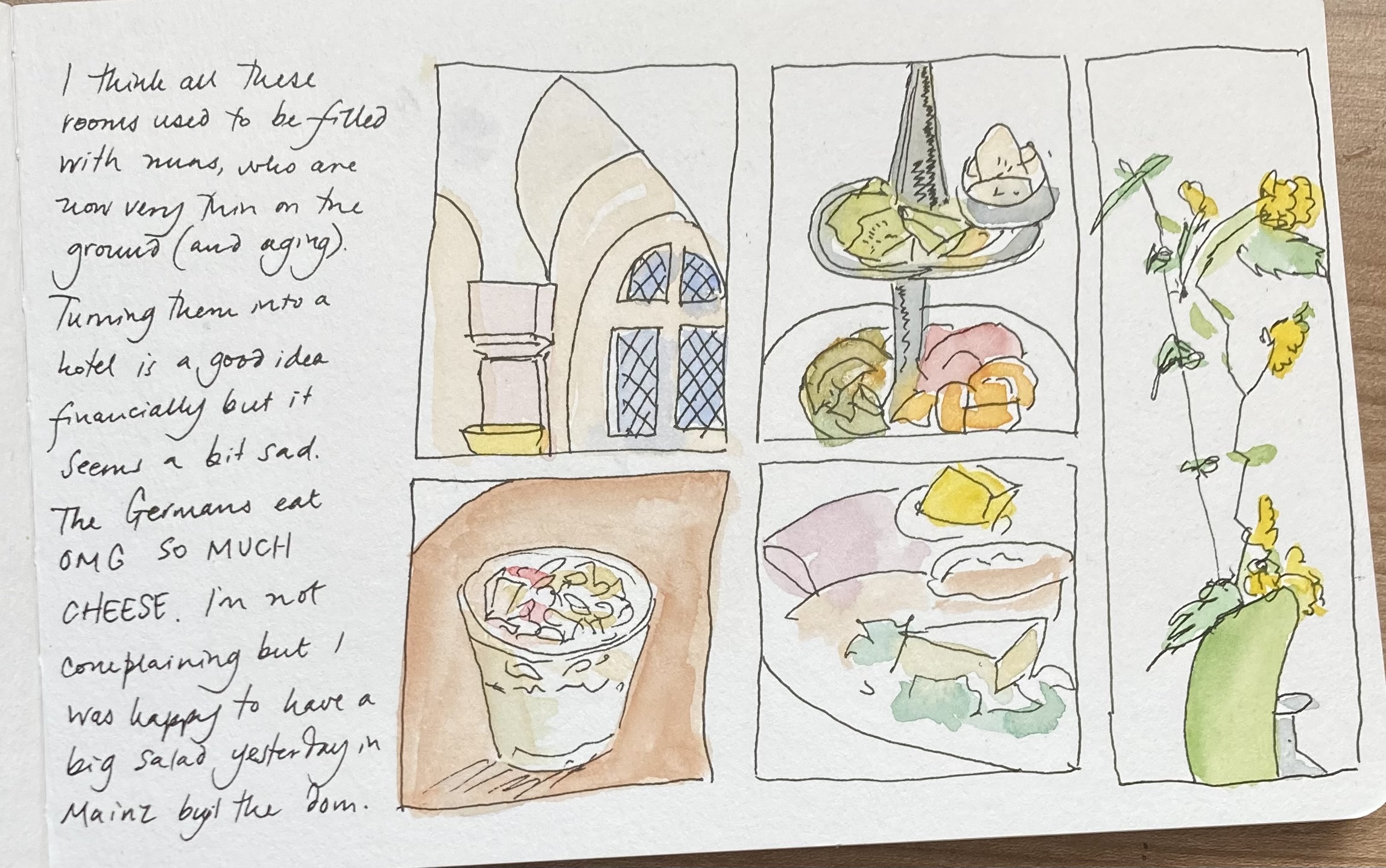
14 April 26
Red Potato
 Sketched with Derwent drawing pencils, Derwent Graphitint pan colors, and a bit of black ink. I’m going to be making lentil soup tomorrow, so I picked up a couple of red potatoes in today’s early morning shop.
13 April 26
Down the Rhine
 I took the KD ferry yesterday from Bingen to Sankt Goar, the most scenic portion of the Rhine. It was a gray day and of course you have to be very fast to sketch while a boat is going downstream. I did here what I’ve been doing on other occasions: drew in pen and filled in color later, from memory and occasionally with reference photos.
 I caught the train from St. Goar to Bonn, arriving in the city in time to have a nice salad lunch before I repaired to my airbnb in the old city. I haven’t used this service at all up till now but I needed a little sanctuary to roam from before I leave for the UK.
 I’ve picked up some kind of bug and the drizzly day hasn’t encouraged me to stray very far though I had a much longer than planned for walk this morning. My sweet host brought down a whole bag of different German medications; I chose one then went and bought some from the pharmacy this morning.
12 April 26
Sunday Urban Sketch
 We still have unsettled skies following this weekend’s storm that brought 0.93” of rain to our house. This sketch is looking across Russell Boulevard from the City Hall building in Davis.
11 April 26
A Day Off
 After traipsing around Mainz for much of yesterday I decided to give my feet a rest and take it easy today, going for short walks in the woods around the church up the hill. I had hoped to go to Bonn on the boat but I don’t think that’s going to work, I should have done my boat trip today.
It is a lovely place, though. A bird I added to my list today was a green woodpecker. These are birds I knew well in Spain 50 years ago and it was fun to catch up with them again.
10 April 26
Dodgy Travel Day
Note: this was written last night but only now have I found the connectivity to post it after a long day of traipsing around Mainz.
I am now in a hotel above the elderly nuns’ residence in Bingen on the Rhine. This isn’t an ordinary hotel and in fact is so far above the town that, after a long day of cancelled trains and unsure of how to get back up here, I’ve decided to call it a night. I’ll be doing some exploring in the morning.
Here’s what I’m thrilled about with regard to my German skills: nobody has immediately switched into English when I open my mouth. My German’s patchy, but I’m holding my own, even under the extreme duress of having boarded the wrong train in the Frankfurt airport, and of subsequently having arrived at the convent a few minutes after six, by which time the doors were closed. (It’s a convent.)
The internet here is so weak I can’t upload any photos just now, but I’ve been drawing the Roman baths in Baden-Baden, the buskers outside the cathedral in Freiburg (there is a pair of kestrels apparently nesting in the belfry!), the delicious cappuccino I had this morning in Freiburg before catching the tram going the wrong direction to the train station… More soon.
Postscript: Here are the buskers with no color yet…

8 April 26
Red Onion
 Sketched with Derwent drawing pencils, watercolor wash, and a smidgen of black ink with an extremely fine fibertip pen. Onions are always fun to sketch.
7 April 26
Sketching on the Train

Today I took the nearly 6-hour journey by train from Hamburg to Baden-Baden. My friend Dagmar had guided me for three days around Hamburg’s excellent public transit system and I felt comfortable enough to negotiate the one here in Baden-Baden (the train station is a few miles out of the city center).
I didn’t add watercolor to these sketches until I got to my hotel, but I don’t think the color is too haywire…
5 April 26
Trossings
 There is a Lutheran church in Davis with a sign outside I’m sure was supposed to be “Crossings,” but because the handwritten lettering was a bit inexpert, looked like “Trossings.”
Here I am in the land of Luther, on Easter Sunday, a very big deal in Germany, a day where people in the U-bahn were carrying baskets laden with food to take to a relative’s. We spent the day wandering around a section of town — on the outskirts, really — called Blankenese, a posh area with a lot of villas overlooking the Elbe. The sun was shining, the wind was blowing, and we had a good walk up and down the steep cobbled streets. Living in Davis, there isn’t a lot of up and down, and my hamstrings are definitely noticing.
My friend Dagmar has been guiding me around. We listened to a lecture by Eckart Tolle this morning as I drew the flowers on her table…

4 April 26
Big Four Building
 Yesterday I went on a return outing to Old Sacramento, a follow-up to my visit to the Crocker Art Museum the previous Friday. The most interesting exhibit at the Crocker was a show of screenprinting from the Royal Chicano Air Force which is an art collective from Sacramento prominent in the 1970s and 1980s. When I walked back via Old Sacramento I noticed that the Sacramento History Museum had another exhibit on the RCAF that was closing soon, so I decided to come back to Old Sacramento yesterday to see that exhibit and do another sketch. This is the so-called Big Four Building, which is the hardware store where the founders of the Central Pacific Railroad initially got extremely wealthy selling goods to Gold Rush miners. The founders were known as the Big Four, and were Collis Huntington, Mark Hopkins Jr., Leland Stanford, and Charles Crocker.